Visualising the New Zealand Index of Multiple Deprivation
Dr Daniel John Exeter, Senior Lecturer, Epidemiology and Biostatistics; Visualisation and Analytics service are provided by Nick Young and Bianca Haux, Research IT Specialists, Centre for eResearch
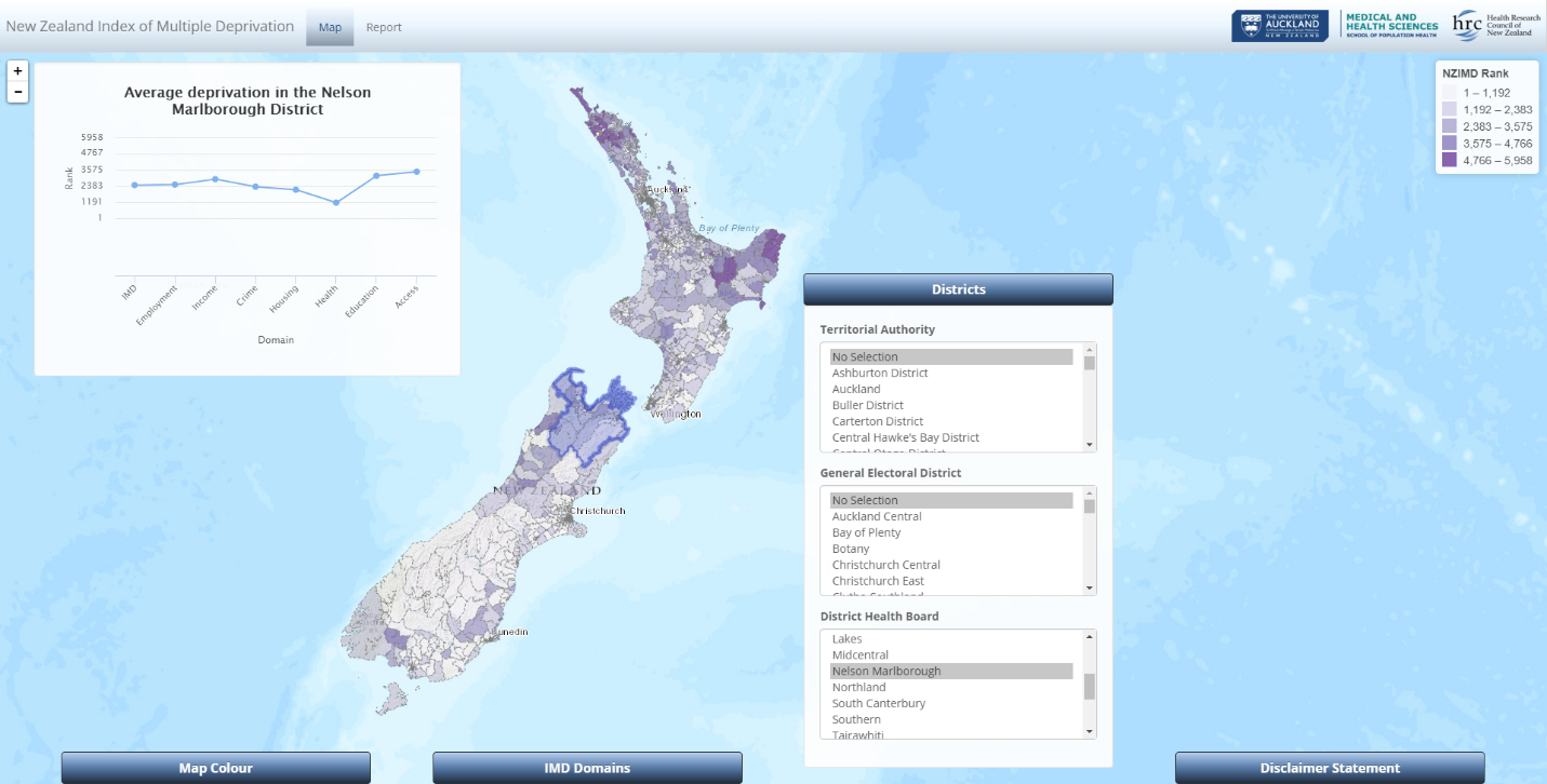
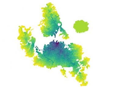
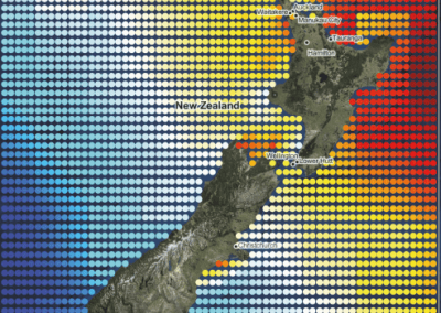
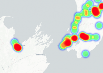
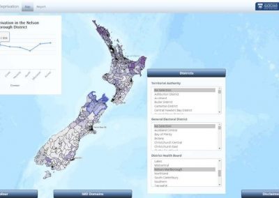
A screenshot of an interactive interface of IMD (Index of multiple deprivation) Nelson, New Zealand.
Background
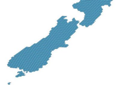
The New Zealand Index of Multiple Deprivation (IMD) allows one to look at disadvantage profile in overall terms, as well as in terms of seven domains of deprivation: employment, income, crime, housing, health, education and access. The seven domains are weighted to reflect the relative importance of each domain in representing the key determinants of socio-economic deprivation, the adequacy of their indicators and the robustness of the data that they use. The IMD uses routinely collected data from government departments, census data and methods comparable to current international deprivation indices to measure different forms of disadvantage. The IMD measures deprivation at the neighborhood level using custom data zones that were specifically developed for social and health research. The New Zealand land mass has 5,958 neighborhood-level data zones that have a mean population of 712 people. In urban settings, data zones can be just a few streets long and wide. Data zones are ranked from the least to most deprived areas (1 to 5958) and grouped into five quintiles for mapping purposes.
The Index of Multiple Deprivation was developed by the IMD team based at Epidemiology & Biostatistics at the School of Population Health: Dr. Daniel John Exeter, Dr. Jinfeng Zhao, Dr. Sue Crengle, Dr. Arier Chi Lun Lee and Michael Browne, with help and support from numerous individuals and organizations.
The vision of the IMD
The research is to look into the impact of deprivation and health inequalities, and improve understanding of service quality and the degree of disparities across population groups, so that it can be used to inform agencies and policy makers, and to prompt system change, a greater responsiveness and equity of health service provision. The aim for the IMD is to be widely used for community advocacy, research, policy and resource allocation. It provides a better measurement of area deprivation, equity of service provision, and a more consistent approach to reporting and monitoring the social climate of New Zealand.
Creating a visual interface for dynamic research analysis
As part of the research project, the IMD team developed a series of online interactive atlases using some proprietary software. The existing atlases are very flexible and informative, but do not provide the ability to create a dynamic report for users to download. The principal investigator Dr. Daniel Exeter therefore sought advice from the visualisation experts at the Centre for eResearch to provide an open-source mapping solution that provided such functionality.
An interactive map interface which can be used to explore the geography of deprivation and its association with a given health or social outcome over the seven domains was developed.
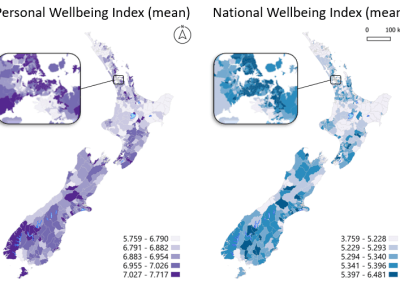
It illustrates the IMD by ranking the data zones from the least to most deprived areas (1 to 5958) and grouping it into five color coded quintiles. Quintile 1 (Q1 – light shading) represents the least deprived 20% of data zones in the whole of NZ; while Q5 (dark shading) represents the most deprived 20%. When a user zooms into a place of interest and selects some data zones of interest, the line graph updates to highlight the rank of overall deprivation (the IMD) and its 7 domains. This is useful in highlighting that the drivers of deprivation can differ markedly between neighborhoods, even if they have similar IMD ranks overall.
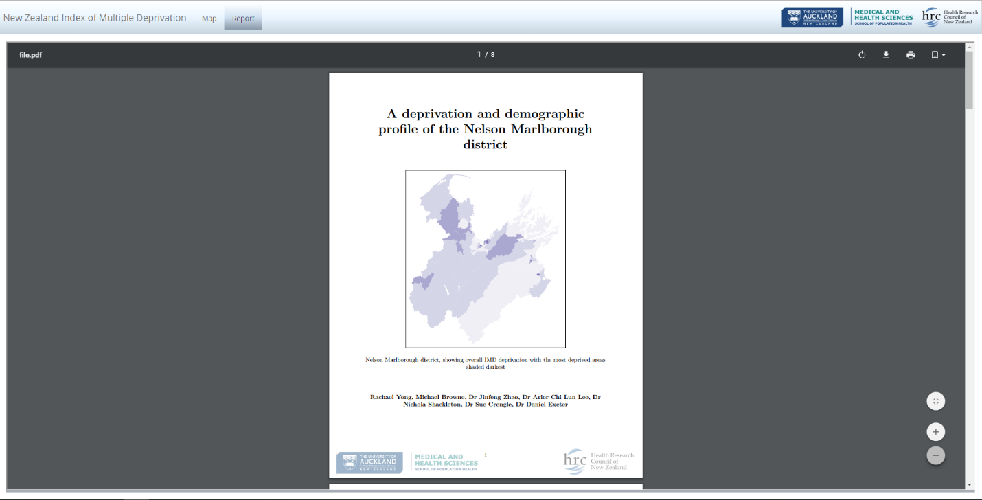
In addition to the interactive map, staff at the Centre for eResearch created an application that provides the means to download dynamically created reports for a particular administrative area of interest. At this stage, users can select from District Health Boards, Territorial Authorities, or General Electoral Districts to zoom into. Every report includes several maps and summary statistics calculated on the fly depending on the user’s choice of district. This combination allows for a great overview while also providing the means to gather selective and detailed information depending on the viewer’s area of interest.
Who is the intended user community?
This project was prompted in part by a request from a District Health Board (DHB) Funding and Planning agency to have reports available within their DHB rather than for the entire population. This atlas will be added to the existing suite of visualisation tools that the IMD team has developed, and to provide outreach for the general public, as well as researchers, policy analysts and organisations who are interested in better understanding the socio-economic circumstances of the communities they serve.
See more case study projects

Our Voices: using innovative techniques to collect, analyse and amplify the lived experiences of young people in Aotearoa
Painting the brain: multiplexed tissue labelling of human brain tissue to facilitate discoveries in neuroanatomy

Detecting anomalous matches in professional sports: a novel approach using advanced anomaly detection techniques

Benefits of linking routine medical records to the GUiNZ longitudinal birth cohort: Childhood injury predictors
Using a virtual machine-based machine learning algorithm to obtain comprehensive behavioural information in an in vivo Alzheimer’s disease model
Mapping livability: the “15-minute city” concept for car-dependent districts in Auckland, New Zealand
Travelling Heads – Measuring Reproducibility and Repeatability of Magnetic Resonance Imaging in Dementia
Novel Subject-Specific Method of Visualising Group Differences from Multiple DTI Metrics without Averaging

Re-assess urban spaces under COVID-19 impact: sensing Auckland social ‘hotspots’ with mobile location data
Aotearoa New Zealand’s changing coastline – Resilience to Nature’s Challenges (National Science Challenge)
Proteins under a computational microscope: designing in-silico strategies to understand and develop molecular functionalities in Life Sciences and Engineering
Coastal image classification and nalysis based on convolutional neural betworks and pattern recognition
Determinants of translation efficiency in the evolutionarily-divergent protist Trichomonas vaginalis

Development of an online Community Engagement Platform (CEP) to facilitate out-facing collaborative research
Measuring impact of entrepreneurship activities on students’ mindset, capabilities and entrepreneurial intentions

Using Zebra Finch data and deep learning classification to identify individual bird calls from audio recordings
Automated measurement of intracranial cerebrospinal fluid volume and outcome after endovascular thrombectomy for ischemic stroke
Using simple models to explore complex dynamics: A case study of macomona liliana (wedge-shell) and nutrient variations
Fully coupled thermo-hydro-mechanical modelling of permeability enhancement by the finite element method
Modelling dual reflux pressure swing adsorption (DR-PSA) units for gas separation in natural gas processing
Molecular phylogenetics uses genetic data to reconstruct the evolutionary history of individuals, populations or species
Wandering around the molecular landscape: embracing virtual reality as a research showcasing outreach and teaching tool


