Decoding the work-from-home phenomenon: insights from location-based service data
Ka Shing Cheunga, I.-Ting Chuangb and Chung Yim Yiua
a. Department of Property
b. School of Architecture and Planning

The global pandemic has catalysed a shift in the job market, with remote work evolving from being an option to a widespread practice. This profound change goes beyond a temporary response to an extraordinary crisis; it could potentially mark the beginning of a new era in employment. In this featured graphic, we evaluate and visualise the work-from-home (WFH) trend in Auckland, the most populous metropolis in New Zealand. Applying a modified open-source machine learning algorithm on location-based service (LBS) data, we have created a visualisation to compare the individual work locations. The results reveal a significantly dispersed workplace distribution following the COVID-19 pandemic. Our visualisation, coupled with entropy analysis, provides prima facie evidence of the WFH trend. This finding holds implications for productivity and carries broader implications for the global workforce.
In a period marked by unprecedented global upheaval, a quiet revolution is occuring in job- home relations. The emerging consensus in contemporary literature posits a hybrid future of work, blending remote and on-site activities as the new standard in many global cities (Yiu et al., 2023). This shift transcends specific demographics, permeating various age groups and professions, thereby reshaping the conventional work environment. However, the ascendance of a new work-from-home (WFH) paradigm in professional life remains a hypothesis yet to undergo rigorous testing. This study ventures a multi-faceted methodology centred around anonymised location-based service (LBS) data analysis. This dataset captures the work routines of millions of mobile device activities during the pandemic, enabling us to explore this evolving transformation of work habits instead of relying on static census data (Credit & Arnao, 2023).
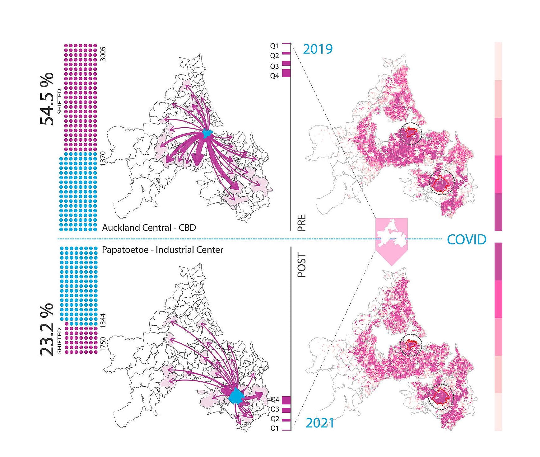
In this study, we applied the R ‘homelocator’ package (Chen & Poorthuis, 2021), a set of machine learning algorithms that use frequency and timestamps of activity to determine a home-like area. The workplace can be inferred using a slightly adjusted set of parameters, including the filtering of timestamps to focus on workdays and working hours rather than week- ends and off-work hours. Our analysis focused on the Auckland Region, approximately 1.7 million residents from 2019 to 2021, comparing pre-pandemic and post-pandemic periods. The visualisation of LBS data unravels a notable trend in home-work patterns: a marked shift towards a more dispersed arrangement of workplaces in 2021 compared to 2019. Remark- ably, 54.5% of individuals altered their work locations, transitioning from the central business district (CBD) to the city fringe, while 23.2% shifted away from the industrial centre of Papatoetoe to other areas. An entropy analysis provides additional insights to quantify the extent of such transitioning, with higher entropy (E) signifying a greater workplace dispersion. The entropy comparison revealed a significant difference (E2019: 7.20, E2021: 7.77; p-value = 1.90e-06), suggesting that workplace dispersion was higher in 2021. The transition to remote work, as depicted by the LBS data, could herald a new chapter in our understanding of work – a trend likely to endure in the post-pandemic world. Its lasting impact or temporary nature war- rants further observation. Businesses navigating this change must adapt strategies to ensure a productive and satisfied.

Figure 1. Spatial patterns of the work-from-home trend in Auckland, New Zealand. Note: The visu- alisation of LBS (location-based services) data on an Auckland region map (left-hand side) showcases a remarkable shift in workplace locations from 2019 to 2021. Approximately 54.5% of individuals changed their work locations, moving from the central business district (CBD) to the city fringe, while 23.2% shifted away from the industrial centre of Papatoetoe to other areas, as indicated by the arrows in the graph. The arrows depict the direction of workplace relocations, and their thickness represents the intensity of such relocations. The thickest arrow corresponds to the upper quartile (Q4), indicating the highest intensity of relocations, while the arrow for the lower quartile (Q1) rep- resents the below 25th percentile. Each 300-metre hexagonal grid on an Auckland region map (right- hand side) is coloured with a deeper purple hue to represent a higher density of work locations. An entropy analysis (right-hand side vertical bar) provides further insights by quantifying the extent of this transitioning, with higher entropy (E) signifying a greater dispersion of workplaces. The entropy comparison revealed a significant difference (E2019: 7.20, E2021: 7.77; p-value = 1.90e-06), suggesting that the workplace locations were much more dispersed in 2021.